Risk-Reward Analysis
Hey traders! 👋
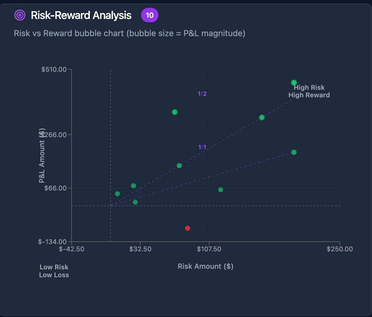
I just shipped something that's been keeping me up at night with excitement - Risk-Reward Analysis in MyPnL.
Here's why this matters:
You know that gut feeling when you close a trade and think "I should have held longer" or "Why did I risk so much for so little?"
This chart answers those questions instantly.
What you'll see:
Green bubbles = Your winning trades
Red bubbles = Your losses (learn from these!)
Position on chart = How much risk you took vs reward you got
The "aha" moments:
Spot if you're cutting winners short
See if you're risking too much for small gains
Find your best trading setups (the ones that actually work for YOU)
Real talk:
This took weeks to perfect. The math behind R-multiples, the visual design, making it work across all security types - it's not easy.
But seeing traders finally understand their patterns? Worth every sleepless night.
Try it free (20 trades, no strings attached)
Already using MyPnL? Check your Stats page - it's live now!
P.S. - If you're still tracking trades in Excel, you're missing out on insights that could change your entire approach. Just saying. 😉
Please authenticate to join the conversation.
Completed
Feature Request
8 months ago

My PnL
Subscribe to post
Get notified by email when there are changes.
Completed
Feature Request
8 months ago
My PnL
Subscribe to post
Get notified by email when there are changes.