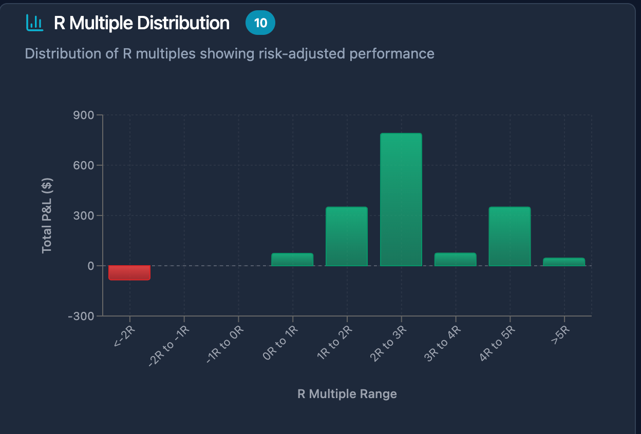
Distribution of R multiples showing risk-adjusted performance
Hey everyone! 👋
Just dropped another feature that's got me genuinely excited - R Multiple Distribution in MyPnL.
Here's the story:
Ever wonder if you're actually a good trader or just got lucky? This chart tells you the truth.
What it shows:
Green bars = Where your profitable trades cluster
Red bars = Your loss zones (we all have them!)
Height of bars = How often you hit each R range
The reality check moments:
Are most of your trades breaking even? (0R to 1R range)
Do you have more big losses than big wins?
Where's your "sweet spot" for consistent profits?
Why this hits different:
Most traders think they're doing great because they had one 5R winner. But what if you had ten -0.5R losers?
This chart shows your actual pattern. No BS, no cherry-picking trades.
The breakthrough:
I realized traditional P&L charts lie to you. A $1000 profit sounds great until you see you risked $5000 to make it.
R-multiples don't lie. They show if you're actually managing risk or just gambling with bigger position sizes.
Personal confession:
When I first built this for myself, it was humbling. I thought I was a decent trader. Turns out, I was just taking huge risks and getting lucky sometimes.
This chart forced me to fix my approach. Now I actually know what works.
The math behind it:
Calculating R-multiples across different security types, handling partial fills, accounting for commissions - it's complex stuff that took weeks to get right.
But when you see your trading personality laid out like this? Game changer.
Check it out in your Stats page - it's live now! 🚀
P.S. - If your distribution looks scary, don't worry. Awareness is the first step to improvement. At least now you know what to fix! 💪
Please authenticate to join the conversation.
Completed
Feature Request
8 months ago

My PnL
Subscribe to post
Get notified by email when there are changes.
Completed
Feature Request
8 months ago
My PnL
Subscribe to post
Get notified by email when there are changes.